


Bobo & Boo
Bobo & Boo is an eco-friendly brand on a mission to provided affordable, stylish and functional dinnerware for kids, and the parents who made them. Made from natural, renewable and sustainable plant fibres, their dinnerware products are non-toxic and biodegradable (yet hold their own in the dishwasher & microwave).
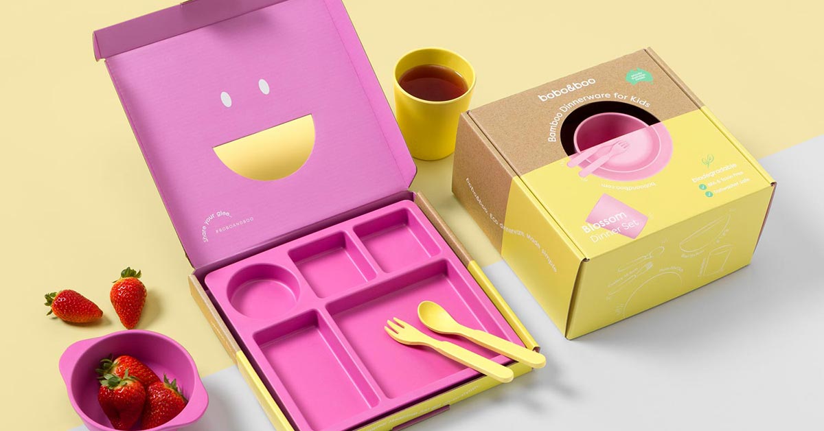
Neverland was engaged to up-level the brand’s visual identity and transform the product packaging from simple, kraft cardboard boxes, to stunning, giftable packaging.
Just as Bobo & Boo’s dinnerware is “kid-friendly, parent approved”, we wanted the design to be kid-friendly, with parent appeal. Because Bobo & Boo is not just about making mealtimes fun, they’re also about providing a fashionable, eco-conscious alternative to the cheap and nasty melamine plates that dominate(d) the market.
To communicate the fun side of the brand, I used vibrant colour, energetic line illustrations and playful text layouts. The cut-out smile also provided an element of fun and encourages tactile interaction and social sharing. While using a kraft paper texture on the packaging helps to communicate the eco-friendly nature of the brand. And the clean, modern layout and ample quiet-space keeps things stylish and sophisticated.
Oh how I love Neverland Studio!!! Of course our product tastes amazing… but it is always our packaging which grabs people’s eye first! Dani absolutely hit the nail on the head, understood our consumer, and captured their attention.
Little Wildling Co wouldn’t have come to life as powerfully as it did without her amazing skills, and her ability to draw out and transform my vision. The investment I made in hiring an expert has definitely paid off when it comes to my numbers, clients and visibility.


