


Beauty Food
Beauty Food creates yummy collagen snacks that support glowing skin, healthy hair and stronger nails. Their revolutionary range of naughty-tasting, guilt-free cookies, nut butters and supplements are designed to both squash your hunger and help you look younger. This means the product has a unique position, as a food product that also sits in the beauty market.
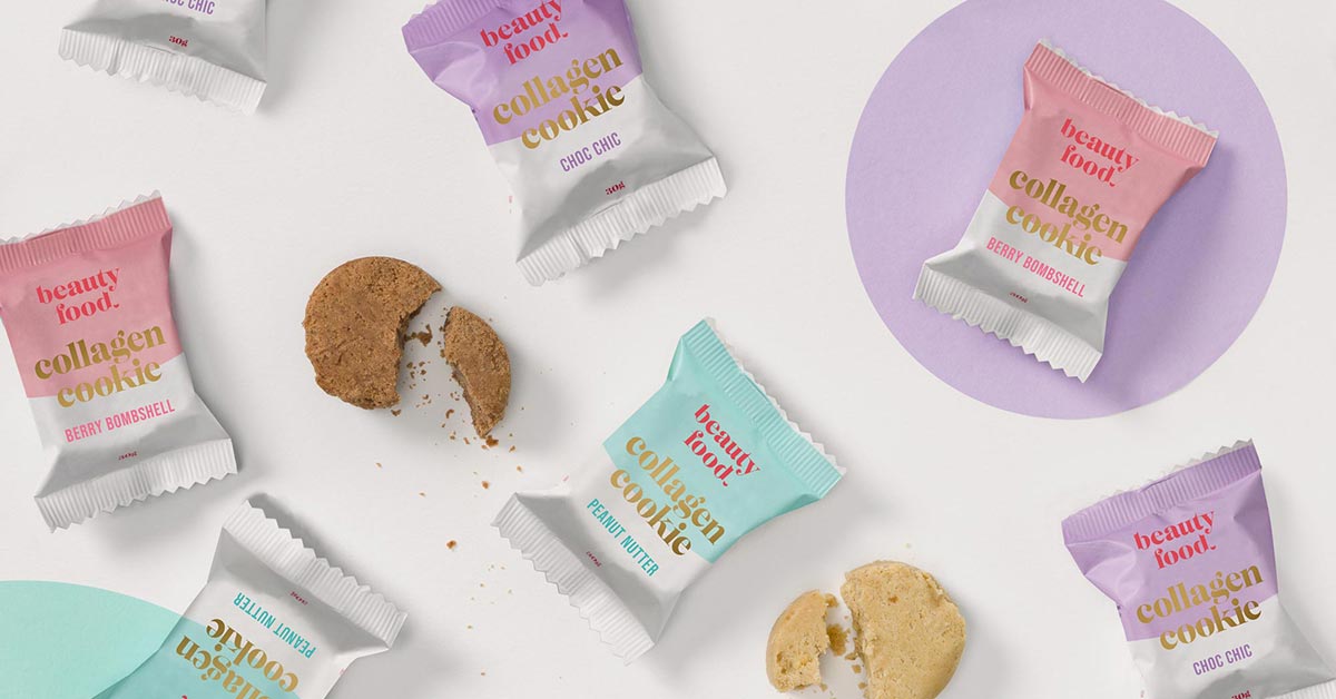
Our goal was to create a brand that would sit confidently in both the food and beauty markets and feel simultaneously appetising and lush. To nail the brief, I researched type, layout and colour theory and conceived of a creative strategy that would effectively bridge both worlds.
To begin, the brand logo uses a stylish serif font with custom, rounded curves that feel plump and youthful, and ‘bites’ in the letters that tap into the edible nature of the product. The brand red was selected for its ability to stimulate the appetite and also tap into beauty trends (red lipstick/nail polish). Pastel colour-blocks introduce a fun, fresh feel to the bites, and help distinguish the product flavours. A gold foil adds to the feeling of glamour.
As the brand attracts attention, I’ve been working with the Beauty Food team to expand their range of product packaging and marketing collateral to meet the booming market.


